

The often underestimated landing page holds the key to the success or failure of a campaign. While its potential to engage and convert readers is frequently undervalued, we are here to provide you with essential best practices, tips, and tricks to optimize your campaign landing pages for maximum success.

What is a landing page?
A landing page is designed to capture a contact's information in exchange for an offer like an eBook, template, or video. It can also be in exchange for more information through a demo, meeting, or over-the-phone consultation. The ultimate purpose of a landing page is to provide a single location where you want users to go to take a specific action (and make a conversion).
It's important to note that while a landing page requires a form, that doesn't mean every web page with a form is a landing page. The difference is that the landing page's sole purpose is for users to fill out the form, whereas another web page might have multiple purposes, like education, instead of conversion.
The best landing pages are optimized for conversion, and that's where we come in. Here are our best tips and tricks to make your landing page successful in converting visitors.
Keep it Simple
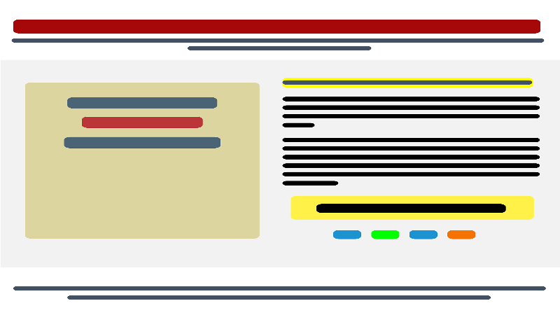
"Keep It Simple" is sage advice for many areas in life. For today's topic, it encompasses general elements of a landing page that will help keep viewers from getting distracted and clicking away before they find your CTA and click where you want them to click.
White space, and lots of it: Leaving plenty of real estate on your landing page free of words is a great way to draw attention to the words you include. This gives more power and meaning to the verbiage and helps your audience focus on your message.
Don't overload the remaining space with words: White space is one thing, but it defeats the purpose if you cram the remaining space full of solid blocks of text. A few key points in the form of a bulleted list and maybe a summary paragraph are all needed. Landing page audiences already clicked through to get to this page, so they shouldn't need much further convincing.
No navigation: Landing pages serve one purpose—to get viewers to click the CTA. The fewer options they have to click elsewhere, the better. So leave off the regular site navigation options. Bonus: this will highlight the CTA even further as it will stand out as the only button on the page. Navigation should return the Thank You page so they can continue browsing the rest of your site.
Graphic elements that point to the action: Using sparse graphical elements can entice readers into the action you're looking for by subtly pointing to the button you want them to click. We're not talking about neon flashing arrows here; think along the lines of the arrow embedded in the FedEx logo.
A CTA that stands out: Use a color wheel to find complementary colors, then make the CTA the opposite. Red on a light gray background, for example. The point is to make the CTA button jump off the page as the primary point of interest. Then once you select a color, set up an A/B test with a different, equally jumpy color to see which resonates better with your audience.
Keep forms minimal
You're already asking for people's personal information in exchange for gated content, access to a webinar, or sign up for an email list. Don't push your luck by asking 101 questions. Name, email, and maybe what industry they're in is enough. That gets them into your CRM and helps you categorize them so you can send relevant content.
Make sure every word counts.
If you've followed the advice above and kept plenty of white space and a minimal word count, you must ensure every word you use serves a purpose. Why is the reader on the landing page in the first place? Why should they care about the information your offer includes? How will this information help them solve a problem?
By addressing only these few questions and creating suitable content for every stage or the buyer's journey, you can keep the viewer's interest and keep them on the page long enough to find and click through on the CTA. Much more than this, and you risk losing their attention and their clicks.
Include multiple CTAs
While talking about clicks, it's a great idea to include several matching CTA buttons. This highlights the importance of this page element and encourages people to click. Put one front and center at the top of the page so people who already know they want in can do so without hunting down a button. Then put one on roughly every page's worth of content so no matter how far they make it down the page, there's always a visible CTA button available to click.
Bonus points: if your page has a sidebar, you can use that real estate to house one more button. This is especially helpful if the sidebar doesn't scroll along with the rest of the page, as the button will stay visible throughout the reader's time on the page. This placement has the bonus of keeping the brightly colored button out of the word flow, making it easier for people to read through more of your text.
Sprinkle in some social proof
People trust other people more than they trust companies. That means landing pages, where you're effectively asking people to trust your company with their contact information, are a great place to slip in some social proof. This can take the form of customer testimonials, industry badges or awards, or maybe a feed from your Twitter timeline that displays mentions from followers.
Put these elements below the fold since it's only likely to be skeptics who scroll past the initial offer and verbiage. This gives them something to reassure them of your credibility and can help quell any remaining misgivings.
Be intentional with your choices
Everything discussed above boils down to this—be intentional. From using action verbs to encourage readers to click that button to keeping that information request form as simple as possible, every element on your landing page should indicate to viewers that time and energy was put into the page. This lets them know, even if subconsciously, that you and your company respect their time and energy, too and that you won't waste it by spamming them or giving them content that isn't worth their effort.
A landing page aims to convert casual viewers of your website to active customers or subscribers. The content should be clear and concise, the CTA button should be the center of attention, and the request form should be simple and minimally invasive. Keep your landing pages up to these standards, and you'll see an immediate uptick in conversions and a slew of happy new customers who trust you to provide more great content in the future.
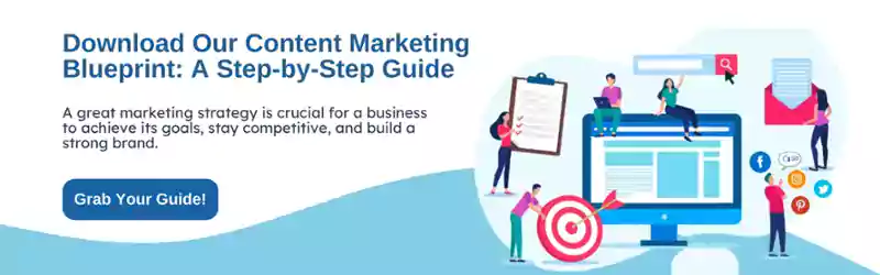
Want to see one of our landing pages (as well as get a free copy of our Content Marketing Blueprint)? Click below.


Leave a Comment
Have thoughts on this article?
Share your feedback, ask questions, or join the discussion with our community.