

Landing pages are essential for successful content marketing, especially lead generation. Most marketers understand the importance of optimizing these pages for maximum impact, but many struggle to achieve desirable landing page conversion rates.
We explore eight proven tactics to boost your landing page performance, helping you generate more leads and conversions.


What is a Landing Page?
When visitors click on a link in an email, ad, or Call-to-Action in a marketing campaign, they land on a landing page.
A landing page aims to convert visitors into leads or customers by providing them with relevant information about your product or service and encouraging them to take specific action, such as subscribing to your email list, downloading gated content, a free ebook, or making a purchase.
Why Do Landing Page Conversions Matter?
-
The average conversion rate of landing pages is about 2.55%. This means that for every 100 visitors to a landing page, only 2.55 will convert into leads or customers. This is a relatively low conversion rate, so there is much room for improvement.
-
Landing pages with a clear and concise call to action have a conversion rate of 25% higher than those without. Including a clear call to action on your landing page is crucial, as it guides visitors to take the desired action easily. Rather than using generic phrases like "Contact us," try using more compelling language such as "Get a free quote with just one click!" The easier it is for visitors to take action, the more likely they are to convert into leads or customers.
-
Landing pages with high-quality visuals have a conversion rate of 123% higher than those without. Visuals are key to enhancing the appeal of your landing page and conveying your message more effectively. They break up the text and add interest to your page. You can use images of your products or services or even infographics to explain your offerings in a more concise manner.
-
Landing pages with testimonials and social proof have a conversion rate of 92% higher than those without. Testimonials and social proof are crucial for establishing trust and credibility with visitors. You can showcase feedback from satisfied customers or display any awards your brand has earned. These elements can significantly impact your landing page's ability to convert visitors into loyal customers.
-
Landing pages optimized for mobile devices have a conversion rate of 61% higher than those not. With the increasing number of people using their mobile devices to browse the internet, ensuring your landing page is optimized for mobile viewing is crucial. Make it easy for visitors to navigate and read your content on their mobile devices to boost conversion rates.
If your lead generation isn't working, a key area to look at is the performance of your landing pages.
1. Headlines, headlines, headlines
According to copyblogger, only 20% of readers read beyond the headline. Look at that number again. 20%. That's it. That means if you want to grab the attention of most of your page visitors, you need to write headlines that capture and captivate them. Be clear and concise; don't use buzzy industry or SEO keywords; make a claim, then follow it up.
Tip: Directly address a pain point. One of the best ways to grab your readers' attention is to directly address a pain point they are experiencing. For example, if you are selling a product that helps people lose weight, your headline could be "Lose Weight Fast and Easy with This New Product."
Example:
-
-
Headline: Lose Weight Fast and Easy with This New Product
-
Body: Are you tired of struggling to lose weight? Do you feel like you've tried everything, and nothing seems to work? If so, you're not alone. Millions of people around the world are struggling with weight loss. But there is hope. A new product on the market can help you lose weight fast and easily.
-
This headline is compelling because it directly addresses the pain point of people struggling to lose weight. It also promises a solution: the product can quickly help people lose weight. This is a very appealing offer, and it will likely grab the attention of people interested in losing weight.
2. Make sure your landing page is relevant to your target audience.
Your landing page should be tailored to your target audience's needs and interests. This means using the right language, images, and tone of voice to resonate with the targeted buyer persona.
Research your target audience's goals and intentions when they arrive on your landing page. Consider what information they seek and align your content accordingly. Anticipate their questions, objections, and desires, providing clear, compelling answers that guide them toward the desired action.
Example: Let's say you're a software company that sells a CRM solution to small businesses. Your target audience is small business owners looking for a way to manage their sales leads and customer relationships.
-
-
Your landing page should be tailored to the needs of these small business owners. You should use language they understand, such as "lead generation" and "customer relationship management."
-
Use images relevant to their business, such as images of people working in an office or using a computer.
-
Your call to action should be clear and concise, such as "Sign up for a free trial today!"
-
3. Use a clear and concise call to action.
Your landing page should have a clear and concise call to action that tells visitors what you want them to do.
-
Create a Sense of Urgency: Encourage immediate action by incorporating urgency into your CTAs. Use phrases like "Limited time offer," "Act now," or "Only available for the next 24 hours." Urgency compels visitors to take action, fearing they might miss a valuable opportunity.
-
Use Action-Oriented Language: Make your CTA action-oriented and compelling. Use strong verbs that convey a sense of empowerment and excitement. Examples include "Get started," "Join now," "Subscribe to our newsletter," or "Claim your free trial." Such language motivates visitors to engage with your desired action.
-
Highlight Benefits: Connect the CTA with the specific benefits visitors will receive by taking action. For example, instead of a generic "Sign up," try "Start saving money today" or "Unlock exclusive tips and tricks." Communicate the value they will gain, enticing them to click.
Example: Let's say you're a company that sells online courses. Your landing page might have a call to action like this:
Sign up for our free trial and start learning today!
This call to action is clear, concise, and action-oriented. It also creates a sense of urgency by saying, "Start learning today." Finally, it highlights the benefit of taking action by saying "free trial."
4. Keep it clutter-free and easy to use
Avoid cluttering your landing page with too much information or unnecessary distractions. Visitors should be able to quickly and easily find what they're looking for. And that includes links to the rest of your website. Yes, I know. "I thought we wanted to keep visitors on our site?" You are keeping them on your site, just not with many links that'll take them everywhere. Landing pages are about one thing and one thing alone—conversions.
When someone clicks a link to your landing page in a social media post, they look for something. They want help with the problem your link told them you would address. When they get to your landing page, all they should see is how you will address that problem and a button to click to get more information.
-
Focus on one message. Your landing page should have one clear and concise message. Don't try to cram too much information into one page.
-
Use high-quality images and videos. Images and videos can help to break up your text and make your landing page more visually appealing. They can also help to tell your story and convey your message more effectively.
-
Use a clear and concise call to action. Tell visitors what you want them to do. Do you want them to sign up for your newsletter? Download a white paper? Make a purchase? Make sure your call to action is clear and easy to understand.
Example: Let's say you're a company that sells online courses. Your landing page might look like this:
Headline: Learn new skills and advance your career with our online courses.

Body copy: Our online courses are designed to help you learn new skills and advance your career. We offer courses on various topics, including business, technology, and personal development. Experienced instructors are available 24/7.
Call to action: Sign up for a free trial today and start learning!
This landing page is clutter-free and easy to use. It has one clear and concise message, uses high-quality images and videos, and has a clear and concise call to action.
5. Use strong visuals
Visuals can help to break up text and make your landing page more visually appealing. They can also help to convey your message more effectively.
Select images that are not only relevant but also of high quality. These visuals should be directly associated with your product, service, or message while maintaining consistency with your brand aesthetics. Avoid using generic or stock photos that may appear cliché or unrelated to your offering.


Example: Let's say you're a marketing agency helping businesses grow their online presence. Your landing page might use images of happy, successful business owners reading your blog and finding additional information. These images would be relevant to your product, high-quality, visually appealing, and consistent with your brand.
-
-
Use images to tell a story. Your images can help to tell the story of your product or service. They can show how your product can benefit your customers or solve their problems.
-
Use images to call attention to your call to action. Your call to action should be the most important thing on your landing page. Use images to draw attention to your call to action and make it easy for visitors to click.
-
6. Optimize Your Contact Capture Form
Simplify your contact capture form by only asking for the essential details. You don't need to know the name of their childhood pet or make them swear an oath on your white paper. All you require is their consent to contact them and a means to do so. Keep it simple and straightforward to maximize your conversion rates.
Simplicity is key, not just in your personal life but also in your contact capture forms. Even if you require a dozen pieces of information, break it into smaller chunks. Ask for only two pieces at a time and show a progress bar at the top to keep your potential customer in the loop. This will make them feel valued and respected, knowing that you appreciate the value of their time. They will have provided all the necessary details and be on their way soon.
Example: Blog subscription sign-up. Here is an example of a contact capture form:
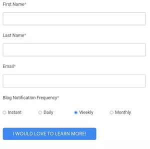
Body copy: Get our email newsletters, notifications of blog posts, events, or webinars, right into your email inbox. You can unsubscribe or change your preferences and frequencies at any time.
Form fields:
-
-
-
Name
-
Email address
- How often you want to be notified
-
-
Submit button: I would love to learn more!
7. Optimize Your Landing Page for Mobile Devices
More and more people are using their mobile devices to browse the internet. Ensure your landing page is optimized for mobile devices so visitors can easily view and interact with it on their smartphones and tablets.
-
A responsive design approach should be implemented to allow elements such as text, images, and buttons to automatically adjust and scale appropriately, providing a consistent viewing experience across different screen sizes and resolutions.
-
Optimize your landing page for fast loading times by compressing images, minimizing code, and leveraging caching techniques to keep their attention. It's crucial to regularly test your page's speed using tools like Google PageSpeed Insights and make necessary optimizations to keep your visitors engaged.
-
Make sure your forms are mobile-friendly by simplifying them and using optimized input fields, checkboxes, and dropdown menus that are easy to use on touchscreens. To increase conversion rates, minimize the required fields, and reduce friction for mobile users.
8. Run A/B tests
Certain aspects of a landing page can attract or repel visitors. The easiest way to determine if your conversion rate could be better is to A/B test some of these aspects.
-
Run two versions of your headline. See which leads to more conversions.
-
Run two colors of your CTA button.
-
Run two differently shaped CTA buttons.
-
Try different text on that CTA; "Click here for your free case study" vs. “Get your Free case study" can make a difference.
It's important to remember only to change one aspect for each test. If you change everything simultaneously, you cannot determine which change led to the jump in conversions.
By following these eight tips, you'll see significant improvements in the conversion rate for your landing pages. And by collecting the metrics from the A/B tests in tip #8, you'll know exactly which tips paid off so you can keep your numbers up going forward!


Leave a Comment
Have thoughts on this article?
Share your feedback, ask questions, or join the discussion with our community.