

Most B2B marketers already know that landing pages are the make-or-break point for conversions. However, knowing and actually reducing friction are two different things.
Over the years, plenty of testing has been done to figure out what motivates prospects to move forward without hesitation. Some findings are surprising. For example, longer landing pages often bring in fewer leads overall, but the ones that do convert tend to be of higher quality.
On the other hand, shorter forms can boost volume but may lower the lead quality you really want. The truth is, there's no universal formula. What works depends on the balance between clarity, trust, and simplicity.
 That's why it helps to focus on proven tactics that consistently minimize drop-offs and make decisions easier for visitors. Here, we'll break down practical ways to fast-track your funnel for conversion rate optimization and create landing pages that perform with less resistance.
Showcase Value, Not Function
A landing page that focuses only on what a product does usually falls flat in B2B. Features alone rarely convince decision-makers. For the page to convert effectively, they need to understand the impact those features will have on their business.
This is why showcasing value works. When prospects see clear outcomes, like saved time, reduced costs, or easier scaling, they can immediately connect your offer to their goals. That connection is what moves them forward in the funnel.
Doing this well comes down to framing:
-
Don’t just list what your service includes. Spell out what the buyer gains.
-
Instead of writing “Automated reporting,” explain, “Save hours each week with automated reports delivered directly to your dashboard.”
-
Tie every feature to a benefit, and keep the focus on solving the client’s problem.
-
Support these points with concise value propositions and, where relevant, data that backs up the claim.
-
Use a simple structure. Include a headline, a supporting sentence, and a short detail if needed.
-
Design also plays a role. Break down value points into scannable sections so readers can quickly identify what matters most.
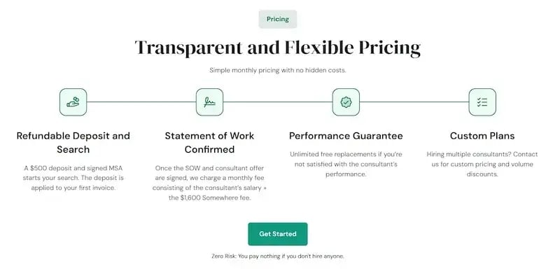
You'll see a great example of this strategy from Somewhere, a platform that helps companies find and hire remote talent. Their landing page on hiring global talent on demand doesn't bury visitors in technical explanations. Instead, it highlights exactly what a company gains by outsourcing through their platform – speed, flexibility, and access to vetted professionals worldwide.
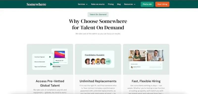
The copy is structured around benefits, from value propositions to unique selling points, and the layout makes it easy to process the information. Clean tables, compare service options, testimonials provide proof, and the transparent pricing structure builds trust.
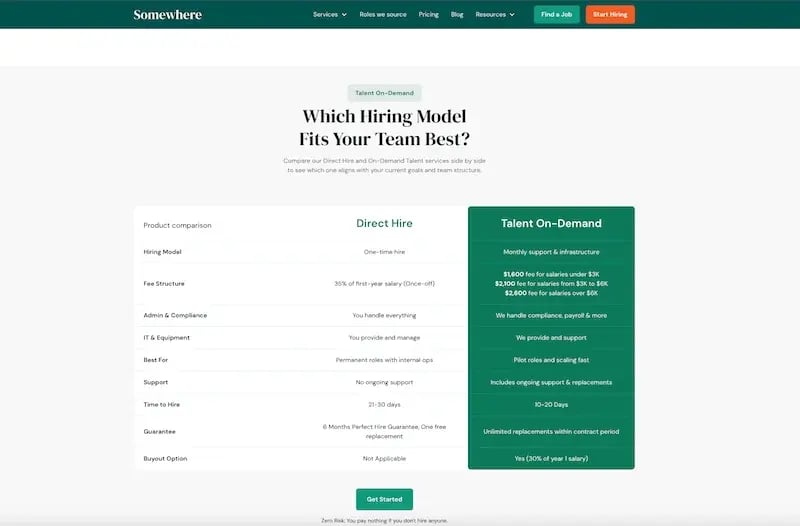
Everything on the page points back to the value clients can expect. That's why it resonates. It removes friction by making the benefits unmistakable and the decision easier.
Create Niche Landing Pages for Each Audience Segment
Broad messaging rarely resonates in B2B because every industry has unique challenges and priorities. A one-size-fits-all landing page often leaves visitors unconvinced that your solution is right for them.
Creating niche landing pages for each audience segment solves this problem. It allows you to demonstrate real understanding of specific sectors, which immediately builds credibility.
On top of that, dynamic landing pages can be aligned with user intent, device type, and audience signals, helping you deliver the most relevant message at the right time.
The most effective approach is to start with segmentation:
-
Identify your main industries or buyer personas and map out their distinct pain points.
-
From there, create dedicated landing pages that highlight solutions tailored to each group.
-
For example, an accounting firm might care most about accuracy and compliance, while a real estate agency might prioritize speed and client communication.
-
Reflect this in your copy, visuals, and calls to action.
-
Avoid duplicating content with small tweaks. Instead, craft messaging that speaks directly to the unique outcomes that matter in each niche.
-
For better performance, include case studies, testimonials, or data points relevant to the audience you’re targeting.
Rosie, an AI answering service that supports businesses across a wide range of industries, is a strong example of this tactic. They've developed nearly 30 industry-specific landing pages, from accounting and insurance to veterinary practices and home services.

Each page focuses on how Rosie helps that particular type of business, highlighting relevant benefits and use cases without generic claims. The structure makes it easy for visitors to see how the service applies directly to their world, which reduces doubt and strengthens trust.
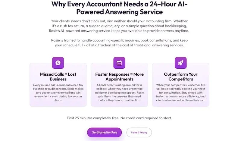
This focused approach creates relevance and gives prospects confidence that the solution was designed with them in mind.
Make Your Product Comparisons Easy and Intuitive
When prospects land on a page with multiple service or pricing options, confusion is one of the biggest deal-breakers. If it's hard to figure out which option fits their needs, they're more likely to leave than to choose.
That's why making product or service comparisons simple and intuitive is so effective. It reduces cognitive load and helps prospects quickly see which option aligns with their priorities. Instead of overthinking, they can focus on the choice itself.
Doing this well requires structure and clarity:
-
A comparison table is often the most straightforward approach.
-
Lay out features, inclusions, and pricing side by side, so visitors can scan differences at a glance.
-
Keep formatting clean. Avoid long paragraphs and use concise descriptions.
-
Highlight the most important differences rather than drowning the user in details.
-
If one option is the most popular or best fit for a majority of clients, make that clear with visual cues like labels or subtle emphasis.
-
Transparency matters here, too. Don’t hide limitations or pricing. Being upfront builds trust.
RE Cost Seg, a company specializing in cost segregation services for real estate owners, shows how effective this approach can be. Their landing page compares two main offers: the Rapid Report and the Fully Engineered Study.
The page uses an extensive table that lists features, inclusions, and pricing in a way that’s easy to scan and digest. Visitors can instantly see what each option provides and where the trade-offs lie.
 By making the decision process straightforward and transparent, RE Cost Seg reduces friction and ensures prospects don't feel overwhelmed, only informed. That clarity helps move leads further down the funnel with confidence.
Leverage Meaningful Social Proof
Social proof is one of the strongest drivers of trust on a B2B landing page, but not all proof carries the same weight. Simple star ratings or generic quotes often feel shallow. What truly builds confidence is context – real stories, specific results, and authentic voices.
Research backs this up: Video testimonials helped 71% of consumers feel more confident in a product’s claims, while only 38% reported the same after reading written reviews. That kind of client trust-building is critical in B2B, where investments are higher and decisions riskier.
To use social proof effectively:
-
Prioritize depth over volume. Go beyond short blurbs by including case studies that show the challenge, solution, and results.
-
Video adds even more impact by letting prospects see and hear real customers speak about their experiences.
-
If video isn’t possible, detailed written success stories or quotes tied to measurable outcomes can be just as powerful.
-
Always connect testimonials to the value your product delivers, not just general satisfaction.
-
Place these elements strategically on the page (near value propositions, pricing, or CTAs), so they reinforce credibility exactly when visitors are considering their next step.
Justworks, a platform providing payroll, benefits, and compliance solutions for small businesses, sets a strong example. On their landing page for employee benefits, they dedicate space for case studies that walk readers through real challenges and the solutions Justworks provided.
 Each entry includes a short summary of the problem, the approach, and the outcome, supported by direct quotes from client representatives. Every case links to a full story, offering deeper insight for those who want it.
This mix of concise, credible highlights with access to more detail makes their social proof meaningful and persuasive, reducing uncertainty and encouraging trust.
Get Strategic with CTAs
Calls to action drive conversions, but the difference between a generic button and a carefully placed, personalized one is massive.
Data shows that personalized CTAs convert 202% better than standard versions. That's because they feel relevant and reduce the hesitation that often comes with clicking. In B2B, especially, CTAs that lower perceived risk make prospects more likely to engage, even if they're not ready to fully commit.
Doing this right means thinking beyond “Sign up” or “Learn more”:
-
Microcopy (the small bits of text around a CTA) can make a big difference.
-
Phrases like “No credit card required” or “Cancel anytime” reduce the stakes.
-
Placement also matters. Put CTAs where they align with user intent – after a feature explanation, near pricing, or alongside testimonials.
-
Don’t overload a page with the same call everywhere. Instead, adjust the language and positioning so each one feels natural in its context.
-
For example, a CTA after a case study might read, “See how this works for your team,” while a button after pricing details could simply say, “Get started.”
-
Keep design consistent, but make copy specific.
Trello, a project management and productivity platform, illustrates this perfectly on its landing page for automation. The primary CTA is straightforward: "Get Trello for free." A secondary CTA invites visitors to "Try Butler," their automation feature. The supporting microcopy makes the second effective: "Start automating today—It's free!”
These CTAs lower perceived risk by emphasizing no upfront cost, making it easier for prospects to click without overthinking. The context-specific placement (tying “Try Butler” directly to the automation feature explanation) keeps the experience seamless. This approach makes Trello's CTAs approachable, relevant, and effective at moving users forward.
Make Contact Forms Minimal and Intuitive
Contact forms are often the final step before conversion, but can also be a major friction point. For instance, including too many unnecessary fields can cause registration completion rates to drop by up to 45%.
In B2B, where buyers are already cautious about committing time or information, every additional field feels like extra effort and an unnecessary barrier. A minimal, intuitive form reduces resistance and helps prospects take the next step without hesitation.
To optimize your contact forms:
-
Focus on only what’s essential for the initial interaction. If the goal is to request a quote, limit the form to a few fields that give you just enough context to prepare for the call.
-
Ask for details like name, company, and email, but avoid requesting things like full addresses, budgets, or timelines upfront.
-
Use clear labels and keep the layout simple, with logical flow from one field to the next.
-
If you must collect more information, consider progressive profiling, where you ask for additional details later in the buyer’s journey rather than all at once.
-
Adding small touches, like autofill support or mobile-friendly design, also makes a big difference.
A perfect example is Reachdesk, a global B2B gifting and swag platform. The form on their demo booking landing page asks for only three things: work email, industry, and primary goal. This strikes the right balance between giving the sales team context and keeping the process effortless for the prospect.
The form's simplicity, combined with its clear purpose, makes scheduling a call feel straightforward instead of like filling out an application.
 By stripping away friction and keeping the form user-friendly, Reachdesk ensures more visitors complete the process and move forward in the funnel.
Final Thoughts
Your competitors are implementing these tactics right now. While you're reading this, they're testing value-focused headlines, building niche landing pages, and streamlining their contact forms.
The question isn't whether these strategies work – the data proves they do. The question is how long you'll wait before implementing them. Every day you delay is another day of lost conversions. The prospects who bounced from your current landing page didn't disappear; they became someone else's customers.
The good news is that you don't need to overhaul everything at once. Pick one tactic from this list and test it against your current approach. Measure the results, then move to the next one. Minor improvements compound quickly when you're dealing with conversion rates.
Or better yet, contact Aspiration Marketing; we'll help you grow.


Leave a Comment
Have thoughts on this article?
Share your feedback, ask questions, or join the discussion with our community.