

Ever pour your heart into your website, only to see visitors disappear after browsing? You're not alone. Many businesses struggle with visitors who vanish without converting.
The truth is, these visitors are interested! But without clear direction, they might not know what to do next. Here's where Calls to Action (CTAs) come in.
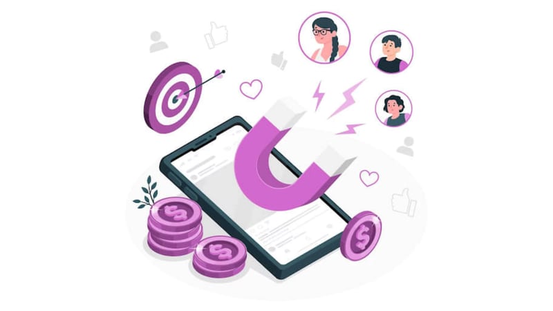

CTAs are those persuasive messages that guide visitors towards specific actions, like downloading an ebook or requesting a demo. They act as conversion bridges, turning website visitors into valuable leads who are one step closer to becoming paying customers.
Consider these statistics:
A clear call to action can increase conversions by up to 200%.
47% of website visitors leave a page within the first few seconds because they can't find a clear call to action.
A/B testing different CTAs can lead to a 30% increase in conversions.
But crafting a compelling CTA isn't a magic trick. For conversion rate optimization, you need to consider where your visitor is in their buyer's journey – the stages they go through before a purchase.
What Type of CTAs Do I Need? Understanding the Buyer's Journey
So, why do some website visitors seem to bounce off your homepage after a quick glance while others delve deeper into your content and eventually convert into leads? The answer lies in understanding the buyer's journey – the path potential customers take as they move from problem awareness to final purchase decision. By tailoring your Calls to Action (CTAs) to each stage of this journey, you can dramatically increase their effectiveness and convert more website visitors into leads.
The Buyer's Journey: A Roadmap to Conversions
The buyer's journey typically consists of three key stages: Awareness, Consideration, and Decision. Each stage represents a different level of the buyer's knowledge and intent, requiring specific CTAs to guide them further down the conversion funnel.
Awareness Stage: At this point, potential customers are just becoming aware of a problem or challenge they face. They might be researching symptoms, browsing industry trends, or simply trying to understand their needs better.
Consideration Stage: Here, buyers have identified their problem and are actively researching solutions. They're comparing different options, evaluating features, and weighing the pros and cons of various products and services.
Decision Stage: Now, buyers have narrowed their choices and are getting ready to decide. They're looking for reassurance and information that helps them choose the best solution for their specific needs.
CTAs Tailored for Every Stage
Awareness Stage
Since visitors in this stage are primarily focused on education and information gathering, your CTAs should aim to build brand awareness and establish your company as a thought leader. Here's what your CTAs might look like:
"Download our Free Ebook: [Topic Relevant to Buyer's Problem]"
"Subscribe to our Newsletter for Industry Insights"
"Watch a Webinar: [Topic Addressing Buyer's Pain Points]"
Notice how these CTAs offer valuable content in exchange for contact information, allowing you to nurture leads and build trust with potential customers.
Consideration Stage
Prospects in the consideration stage are more engaged and actively evaluating solutions. Here, your CTAs need to shift focus towards highlighting the benefits of your product or service and addressing their specific pain points.
"Get a Free Trial of our Software"
"Request a Demo to See How We Can Help"
"Read our Blog for In-Depth Guides on [Relevant Topic]"
- "Download a Comparison Guide: [Your Product vs. Competitors]"
These CTAs offer a deeper dive into your solutions, allowing prospects to experience firsthand how your offering solves their challenges.
Decision Stage
By the decision stage, buyers are ready to commit. Your CTAs should focus on removing any remaining hesitation and nudging them toward conversion. Here are some powerful CTAs to use:
"Start Your Free Consultation Today!"
"Contact Us for a Personalized Quote"
"Started Generating Results with [Our/This Product or Service] Within 2 Weeks!"
"Limited-Time Offer: Upgrade Your Account Now!"
- "Download a Case Study: [Showcasing Positive Customer Results]"
These CTAs offer a clear path to a purchase or the next step in the buying process, making it easy for prospects to convert.
Crafting Multiple CTAs
Imagine having just one sales pitch for every potential customer. It wouldn't be very effective, right? The same goes for CTAs. While a single CTA might get the job done sometimes, the real power lies in crafting multiple variations for each buyer's journey stage.
There are several compelling reasons to embrace CTA variations:
Appeal to Different Preferences: People respond to messaging in various ways. Some prefer clear and concise CTAs, while others might prefer more creative or curiosity-driven options. With variations, you cater to different visitor preferences, increasing the chances of capturing their attention.
Optimize for Specific Devices: How people interact with your website can vary depending on the device they're using. A long, text-heavy CTA might work well on a desktop but appear clunky on a mobile phone. Crafting variations allows you to tailor CTAs for optimal performance on different screen sizes.
A/B Testing for Continuous Improvement: The beauty of variations lies in the ability to A/B test them. This allows you to compare different CTAs side-by-side and see which ones resonate best with your audience. Over time, you can refine your CTAs based on data, ensuring you use the most effective versions for each buyer's journey stage.
By embracing CTA variations and utilizing A/B testing, you can unlock valuable data and continuously optimize your CTAs to drive higher conversions and maximize your website's potential.
CTA Variations in Action
Let's take a deep dive into how CTA variations can dramatically increase your eBook downloads, specifically targeting blog posts within the Awareness stage of the buyer's journey. Here, we'll showcase four unique CTAs promoting the same downloadable eBook, each designed to capture visitor interest in different ways:
1. Simple Inline Text CTA
Imagine a short, clear line of text embedded within your blog post like this:
This straightforward approach delivers a clear message without overwhelming visitors. Consider pairing this text CTA with a relevant image (e.g., an engaging social media graphic) to entice clicks further.
2. Simple Button CTA
For a bolder approach, consider a button CTA integrated seamlessly into your blog post layout. This could say something like: "Get Your Free Copy: The Ultimate Guide to Social Media Success." The bright button format adds a visual cue, prompting immediate action.

3. Slide-in CTA
Imagine a captivating image with a concise message that slides in from the side of your blog post at strategic intervals. This "slide-in" CTA could offer: "Boost Your Social Media Game: Download Our Free eBook Here!" This subtle approach grabs attention without disrupting the reading flow.
4. Image CTA
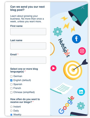
Think of an engaging image directly related to your eBook's content (e.g., an infographic showcasing social media statistics). Overlay the image with a compelling call to action like: "Unlock the Secrets to Social Media Success! Download Our Free eBook (Click on the Image!)." This visual approach leverages the power of imagery to drive interest and downloads.

Naming Your CTAs
Keeping track of your CTAs can be challenging, especially when crafting multiple variations for different campaigns. Here's where a clear naming structure comes in, saving you time and ensuring smooth implementation.
Our recipe for success has three key ingredients:
Placement: Start by indicating where the CTA will reside. This could be "Blog," "Pillar Page," or even "Email."
Location on Page: Next, specify the CTA's on-page location. Common examples include "Inline Text," "Bottom," or "Slide-In."
Destination: Finally, describe where the user lands after clicking. This is typically a landing page (LP) with a specific offer.
Now, let's put this recipe into action! Here's an example:
Blog - Inline Text -> LP | Awareness Free Trial
This CTA name tells us it's an inline text CTA designed for blog posts. Upon clicking, it directs users to a landing page offering a free trial, perfect for capturing leads in the Awareness stage of the buyer's journey.
By adopting this naming structure, you'll create a system for easy organization, allowing you to quickly identify the right CTA for any marketing initiative.
Mastering the Art of CTAs
CTAs are the bridge that guides website visitors from passive browsing to active engagement. By tailoring your CTAs to each stage of the buyer's journey, you speak directly to their needs and motivations, dramatically increasing your chances of conversion.
Ready to take your website's conversion power to the next level? Implement these CTA best practices today and watch your lead generation soar! Want to delve deeper into the world of inbound marketing strategies designed to attract, engage, and delight your audience? Contact Aspiration Marketing to discover how our solutions can help you achieve your marketing goals.


Leave a Comment
Have thoughts on this article?
Share your feedback, ask questions, or join the discussion with our community.