

Ever pour your heart into crafting a website, only to see visitors bounce without a single click? You're not alone. The culprit? Often, it's weak Calls to Action (CTAs). These are the buttons, banners, or text prompts that nudge visitors toward your desired action, like signing up for your email list or making a purchase.
Without clear and compelling CTAs, your website becomes a scenic detour, not a source of converting leads.


The Power of CTAs
Imagine a salesperson who simply greets customers but never asks for the sale. That's what happens when your website lacks a clear Call to Action (CTA). A CTA is a concise, action-oriented prompt that directs website visitors toward the next step in your conversion funnel - a crucial element of any content marketing strategy. This could be anything from subscribing to your newsletter to adding an item to their cart.
Think of your conversion funnel as a journey. CTAs act as signposts, guiding visitors towards the desired destination – a conversion. Strong CTAs not only boost conversions but also clarify your website's purpose. Visitors instantly understand what action you want them to take, leading to a more focused and productive user experience.
The effectiveness of a CTA hinges on the power of persuasion. Studies by HubSpot reveal that clear and strong CTAs can increase conversion rates by up to 97%. This persuasive power taps into basic human psychology. Clarity removes hesitation, while urgency (think limited-time offers) creates a fear of missing out, motivating visitors to take action before the opportunity disappears. Effective CTAs also speak to the user's needs and desires. By highlighting the benefits of taking action ("Download our free guide and boost your sales by 20%!"), you create a compelling reason for visitors to convert.
Types of CTAs and When to Use Them
Not all CTAs are created equal. Choosing the right format depends on your specific goals and audience. Here's a breakdown of the most common CTA types and how to leverage them for maximum impact:
Buttons
Buttons are the reliable workhorses of the CTA world. Their versatility makes them suitable for almost any conversion goal. Placement matters! Place prominent CTAs "above the fold" (visible without scrolling) on key landing pages. Secondary CTAs can work well at the bottom of blog posts or web pages. For design, keep it simple and use contrasting colors to make your button stand out. Clear and concise copy ("Shop Now" or "Get Started") ensures visitors understand what action to take.

Banners
Banners are eye-catching visuals that can grab attention and promote high-value offers. They excel at showcasing limited-time deals or promoting new product launches. Keep banner CTAs clear and concise, and ensure the design complements your website aesthetic.

Slide-in Forms
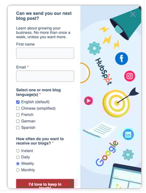
Pop-ups, like slide-in forms, can be a powerful tool for capturing leads. However, overuse can lead to frustration. Use them strategically, like after a visitor spends a certain amount of time on a page or exits intent (showing a pop-up when a visitor moves their cursor towards the browser tab to close). It can be helpful to offer a clear value proposition in exchange for the user's information ("Get 10% Off Your First Order" with a prominent "Sign Up Now" button).
In-line Text
Text links can be effective CTAs for subtle nudges within content. Use them strategically within blog posts to encourage readers to explore related content ("Read More Here"). In-line CTAs, placed within website copy, offer another unobtrusive option.
Remember: Experimentation is key! Test different CTA formats and placements to see what resonates best with your audience (we'll discuss this in further detail later on).

Crafting Compelling CTAs
Before diving into crafting your CTAs, it's essential to have a clear roadmap. Here's a step-by-step guide to ensure your CTAs are conversion powerhouses:
1. Define Your Conversion Goal
What action do you want website visitors to take? Specificity is key! Is it downloading an ebook, signing up for your email list, or making a purchase? Knowing your goal allows you to tailor your CTA to influence that action directly.
2. Know Your Audience
Imagine crafting a compelling sales pitch without knowing your audience's needs. The same applies to CTAs. Understanding your target audience allows you to craft CTAs that resonate with their desires and pain points.
This is where buyer personas come in. These semi-fictional representations of your ideal customer capture their demographics, goals, and challenges. By understanding your buyer personas, you can tailor your CTAs to address their specific needs.
For example, if your target audience is budget-conscious young professionals, a CTA offering a "Free Budget-Planning Guide" would likely be more appealing than a generic "Download Our Ebook."
3. Write Action-Oriented Copy
Your CTA copy is your final nudge toward conversion. Make it count by using strong verbs that leave no room for ambiguity. Instead of a bland "Learn More," use an action-oriented phrase like "Download Our Guide Now."
Here's the difference between weak and strong CTA copy:
-
Weak: Learn More About Our Services (Passive, uninspiring)
-
Strong: Schedule Your Free Consultation Today (Action-oriented, creates urgency)
Bonus Tip: Numbers and quantifiable benefits can add power to your CTAs. Consider using phrases like "Get 10% Off Your First Order" or "Increase Sales by 20% in 30 Days."
By following these steps and keeping your audience in mind, you can craft compelling CTAs that act as conversion catalysts, propelling website visitors toward your desired outcome.
Designing CTAs for Action
A well-crafted CTA is only half the battle. Your CTA needs to be visually appealing and clear as day to maximize conversions. Here's how to design your CTAs for optimal impact:
Visual Appeal
Think of your website as a busy marketplace. Your CTA needs to be the brightly lit, eye-catching storefront that draws visitors in. Here's how to achieve that:
-
Color is crucial: Use contrasting colors to make your CTA button pop against the background. A vibrant orange button on a blue background grabs attention, while a white button on a light gray background may easily get lost.
-
Size matters (but not too much): Your CTA should be large enough to be easily noticed, but not so large that it overwhelms the page layout. Experiment to find the sweet spot.
-
White space is your friend: Don't crowd your CTA. Use sufficient white space around the button to create a visual break and draw attention to the call to action.
Clarity is Key
Your CTA copy should be crystal clear. Visitors should instantly understand what action you want them to take. Here are some tips:
-
Keep it concise: Short and sweet is the name of the game. Aim for 2-5 words that encapsulate the desired action.
-
Use strong verbs: Replace passive verbs like "learn" with action verbs like "download," "get," or "start."
-
Focus on benefits: Highlight what users gain by taking action. Instead of "Subscribe," try "Get Exclusive Deals."
A/B Testing
The beauty of digital marketing is the ability to measure and refine your approach. A/B testing is a powerful tool for optimizing your CTAs. Here's how it works:
Imagine you have two different CTA button designs. You can run an A/B test where a portion of your website visitors see version A, and the others see version B. By tracking which version generates a higher conversion rate, you can identify the more effective design and refine your CTAs for continuous improvement.
Remember, crafting high-performing CTAs is an ongoing process. By focusing on visual appeal, clarity, and A/B testing, you can ensure your CTAs are conversion magnets, pulling visitors toward your desired action and boosting your website's success.
CTA Best Practices
-
Demonstrate urgency: People respond to deadlines. Leverage this by creating a sense of urgency with your CTAs. Limited-time offers ("Get 20% Off Until Friday!") or limited-availability promotions ("Only 10 Spots Left!") nudge visitors to take action before they miss out.
-
Highlight benefits, not features: Nobody cares about features – they care about benefits. Your CTA copy should highlight what users gain by taking action. Instead of a generic "Sign Up," showcase the value proposition: "Get Exclusive Deals and Free Shipping!"
-
Track, analyze, and improve: Your CTAs are living, breathing entities. Don't set them and forget them! Track your results. Use website analytics to monitor CTA performance. See which CTAs convert best and which ones fall flat.
-
A/B testing: We'll repeat it: use A/B testing. Test different CTA variations (copy, color, placement) to see which resonates best with your audience. You'd be surprised by the difference a color or change in wording can have on your click rates.
-
Triple check links: Your CTA should lead to another website, landing page, or form. Triple-check that your CTA is sending visitors to the right page and that all links are working correctly - broken links are conversion killers, and visitors won't take the time to find the right page if you don't.
-
Strategically build forms and landing pages: Imagine a visitor clicks your CTA, only to face a lengthy, complex form. Reduce friction by streamlining the post-CTA process. Short, user-friendly forms and a clear conversion pathway ensure a smooth journey from click to conversion. Craft targeted landing pages that align with your CTA and offer valuable gated content (e.g., ebooks, white papers) in exchange for user information.
Common CTA Mistakes to Avoid
Even the most well-intentioned CTAs can fall flat if you fall into common pitfalls. Here are a few mistakes to keep on your radar:
-
Generic CTAs: "Click Here" or "Learn More" are bland and uninspiring—spice things up with action verbs and clear benefits.
-
Misaligned CTAs: Your CTA should be relevant to the content and audience. Don't offer a "Buy Now" button on a blog about industry trends.
-
Overlooking mobile optimization: A significant portion of website traffic comes from mobile devices. Ensure your CTAs are mobile-friendly and easy to click on smaller screens.
By implementing these pro tips, you can significantly boost your conversion rates. Remember, it's a continuous process of testing, analyzing, and refining. With dedication and data-driven insights, you can transform your CTAs into conversion powerhouses, propelling your website toward success.
Ready to watch your conversions soar? Implement these tips and unleash the power of compelling CTAs on your website!


Leave a Comment
Have thoughts on this article?
Share your feedback, ask questions, or join the discussion with our community.